
Почему Adalo идеален для создания приложений, ориентированных на пользователя
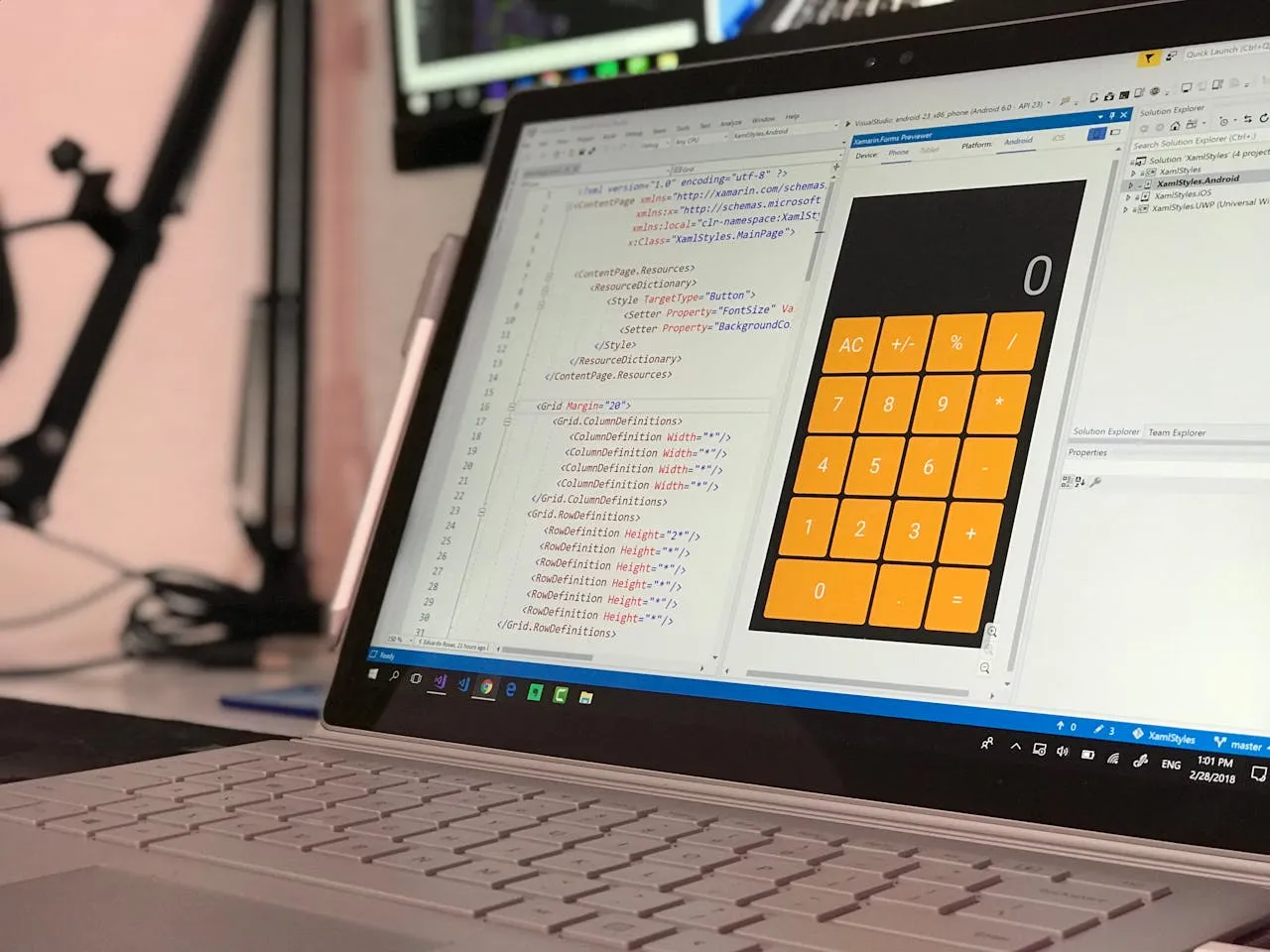
Adalo — это конструктор приложений без кода для веб-приложений на основе базы данных и нативных приложений iOS и Android — одна версия для всех трёх платформ, опубликованная в Apple App Store и Google Play. Это означает, что вы можете сосредоточиться меньше на технической сложности и больше на том, что действительно важно: на словах, которые направляют пользователей через каждый экран, кнопку и взаимодействие в вашем приложении.
Когда ваше приложение находится в основных магазинах приложений наряду с миллионами конкурентов, отшлифованная UX-копия становится критическим дифференциатором. Пользователи формируют мнение в течение секунд, а микротекст на экранах-заставках, потоках онбординга и кнопках навигации определяет, останутся ли они или удалят приложение. Благодаря тому, что Adalo занимается разработкой и развёртыванием, у вас есть возможность создать копию, которая превратит случайных загрузчиков в преданных пользователей.
Кусочки текста, которые направляют вас через приложение — приветствие на экране-заставке, инструкции на странице регистрации, метки кнопок, которые вы нажимаете для навигации — эти короткие предложения рассказывают большую историю о вашем продукте и причине его существования. Когда вы создаёте приложение, которое будет жить в Apple App Store или Google Play Store, каждое слово имеет вес.
Adalo, конструктор приложений на базе искусственного интеллекта, позволяет вам создавать веб-приложения на основе базы данных и нативные приложения iOS и Android из одной кодовой базы. Благодаря тому, что техническая сложность обработана, вы можете сосредоточиться на том, что действительно формирует восприятие пользователя: микротексте на каждой кнопке, уведомлении и экране. Пользователи ожидают отполированные, профессиональные впечатления, и это включает слова, которые направляют их через ваше приложение.
Почему Adalo идеален для создания удобных приложений
Когда ваше приложение публикуется прямо в оба основных магазина приложений, ставки на качество взаимодействия с пользователем резко возрастают. Adalo справляется с трудной частью — компиляцией нативного кода и управлением отправками в магазин приложений — чтобы вы могли направить свою энергию на создание копии, которая направляет, восхищает и преобразует.
Ada, конструктор искусственного интеллекта Adalo, позволяет вам описать то, что вы хотите, и генерирует ваше приложение. Magic Start создает полные основы приложения из описания, а Magic Add добавляет функции на естественном языке.
С Волшебное началовы можете сгенерировать полные основы приложения из простого описания. Скажите, что вам нужно приложение для отслеживания фитнеса, и оно создаст структуру вашей базы данных, экраны и пользовательские потоки автоматически. То, что раньше занимало дни планирования, теперь происходит в считанные минуты, давая вам больше времени, чтобы отшлифовать слова, которые ваши пользователи действительно будут читать.
Копия пользовательского интерфейса (UX)
Вы сразу же узнаёте плохую UX-копию — она оставляет вас в растерянности о том, какую кнопку нажать, или заставляет вас задаваться вопросом, не будет ли вам случайно выставлена плата за что-то. Текст на кнопках часто является последним, о чём думают дизайнеры, но это имеет огромное значение в том, как люди воспринимают и доверяют вашему приложению.
Хотя слова на экране не могут заменить настоящий разговор, хорошая UX-копия может заставить взаимодействие с приложением ощущаться как разговор с другом. Принцип прост: если ваш продукт звучит по-человечески, люди более склонны доверять ему и использовать его.
Хорошая копия + хороший дизайн = лучшие приложения
Слова заполняют разрыв между намерением вашего дизайна и реальностью пользователя.
Если вы дизайнер, вы хотите дать пользователям впечатление от приложения, которое было бы гладким и без трений. Но ни один дизайн не может объяснить себя полностью. Именно здесь вступают в игру слова — они заполняют разрыв между тем, что мы хотим, чтобы люди делали, думали или понимали, и их текущей реальностью.
Как хорошая UX-копия повышает ценность вашего дизайна
- Направление: Она показывает вашим пользователям, что делать дальше
- Ясность: Она объясняет ошибки, не расстраивая людей
- Ожидания: Она устанавливает чёткие ожидания относительно того, что произойдёт при нажатии
- Радость: Она заставляет людей улыбаться и чувствовать связь с вашим приложением
Вот что важно помнить: вам не нужны нужно часами работать над копией или нанимать UX-писателя. Если вы ищете очень специфический тон и впечатление, профессионал может помочь воплотить ваши идеи. Но если вы хотите попробовать сами, эти принципы вам помогут.
Как писать UX-копию как профессионал
Используйте эти принципы, чтобы сделать UX-копию в вашем приложении лёгкой для понимания, продуманной и привлекательной.
Говорите кратко
Это вызов, с которым сталкиваются все при попытке упростить что-то сложное. Мы хотим успокоить людей со всеми деталями и всей информацией, которая, как мы думаем, им нужна. Реальность? Большинству людей не нужны детали — особенно при использовании мобильного приложения.
Вместо этого спросите себя: «Какая самая важная информация нужна кому-то именно на этом этапе?» Они входят в систему и должны найти другое имя пользователя, потому что это занято? Им нужно проверить другой раздел приложения, чтобы найти то, что они ищут? Им нужно подтвердить, бронируют ли они класс?
Ответ на этот вопрос поможет вам написать быстрые, звучные, короткие предложения. Старайтесь не более чем на 8 слов на кнопку или инструкцию.
Профессиональный совет: если вам сложно быть кратким, напишите всё, что нужно сказать, а затем вычеркните весь лишний текст.
Откажитесь от жаргона
Вполне возможно, что вы случайно используете в своём приложении очень технический язык, который ничего не значит для пользователя. Жаргон включает любые слова или фразы, которые требуют от читателя предварительных знаний о чём-то, что он может не знать.
При написании UX-копии избегайте жаргона, потому что последнее, что вы хотите сделать — это запутать людей, для которых вы создаёте приложение. Это может вас удивить — учитывая, что наша первая рекомендация была сохранить краткость — но самая короткая фраза может быть не всегда наиболее эффективной.
Иногда чуть больше текста может очень помочь в передаче смысла. Например:
| Технически | По-человечески |
|---|---|
| Способ платежа | Выберите, как вы хотите платить |
| Требуется аутентификация | Пожалуйста, войдите, чтобы продолжить |
| Сеанс истёк | Вы вышли из системы — давайте вас вернём |
Оба подхода верны, но один звучит более личным и более человечным, чем другой.
Совет профессионала 1: Если сомневаетесь, прочитайте вслух. Если звучит неестественно или как робот, измените.
Совет профессионала 2: Если вас беспокоит жаргон, попросите друзей и семью проверить. Когда текст понятен людям без специальных знаний, он готов.
Сочетайте визуальные элементы со словами
Исследование Nielsen Norman Group показывает, что почти 80% пользователей сканируют страницы веб-сайтов и полагаются на визуальные элементы, такие как изображения и значки, чтобы понять контекст. Только 16 процентов читают весь текст.
Нельзя отрицать важность потрясающих изображений и визуальных элементов, но нам также необходимо убедиться, что визуальные элементы и текст работают вместе. В некоторых случаях полезно включить значки И текст, если у вас разнообразная аудитория, которая может иметь разные интерпретации.
Интересный факт: Люди обычно читают текст в форме буквы F. Они читают первую строку, затем вторую строку, а затем скользят вниз по странице, обращая внимание только на первое или второе слово каждого предложения. Хороший дизайн помогает нарушить эту схему — что-то интересное появляется в каждом разделе.
Используйте эту формулу для первого и второго лица
Давайте быстро освежим в памяти:
- Первое лицо = я, мне или мой
- Второе лицо = ты, вы или ваш
Первое лицо — хороший способ показать пользователю, что принадлежит именно ему в приложении (например, «Мой профиль», «Мой аккаунт»). Второе лицо — это простой способ провести пользователей через процесс или путешествие (например, введите номер вашего аккаунта, выберите свой аватар), или просто добавить личный штрих (например, «Ой... у вас закончились кредиты!»).
Будьте последовательны
Придерживайтесь своей терминологии. Больше последовательности равно меньше путаницы. Если вы решили назвать процесс организации чего-либо «Планирование» в одной части приложения, не называйте его «Бронирование» в другом месте.
Вот простой способ обеспечить последовательность: проверьте экраны приложения, чтобы убедиться, что язык, который вы используете, последователен. Возможно, вы захотите стандартизировать, чтобы кнопки на экране входа говорили «Далее» или «Продолжить».
Title case или sentence case — какой использовать?
Title case выделяется больше. Прописные буквы обращают внимание на ваш текст так, что это может помочь подчеркнуть что-то. Это также способ отличить текст заголовка от основного текста, если у вас нет множества вариантов шрифтов.
Sentence case легче читать, особенно когда текст становится длинным. Где бы у вас ни был блок текста, всегда проще для глаз, когда это написано строчными буквами.
Обратите особое внимание на эти экраны
Знаете ли вы, как особенное блюдо может помочь сделать мероприятие, такое как день рождения или годовщина, более запоминающимся? Давайте применим это к UX-копии. Некоторые важные экраны предоставляют возможность по-настоящему произвести впечатление на пользователей. Это ваши особые возможности быть уникальными, полезными и запоминающимися.
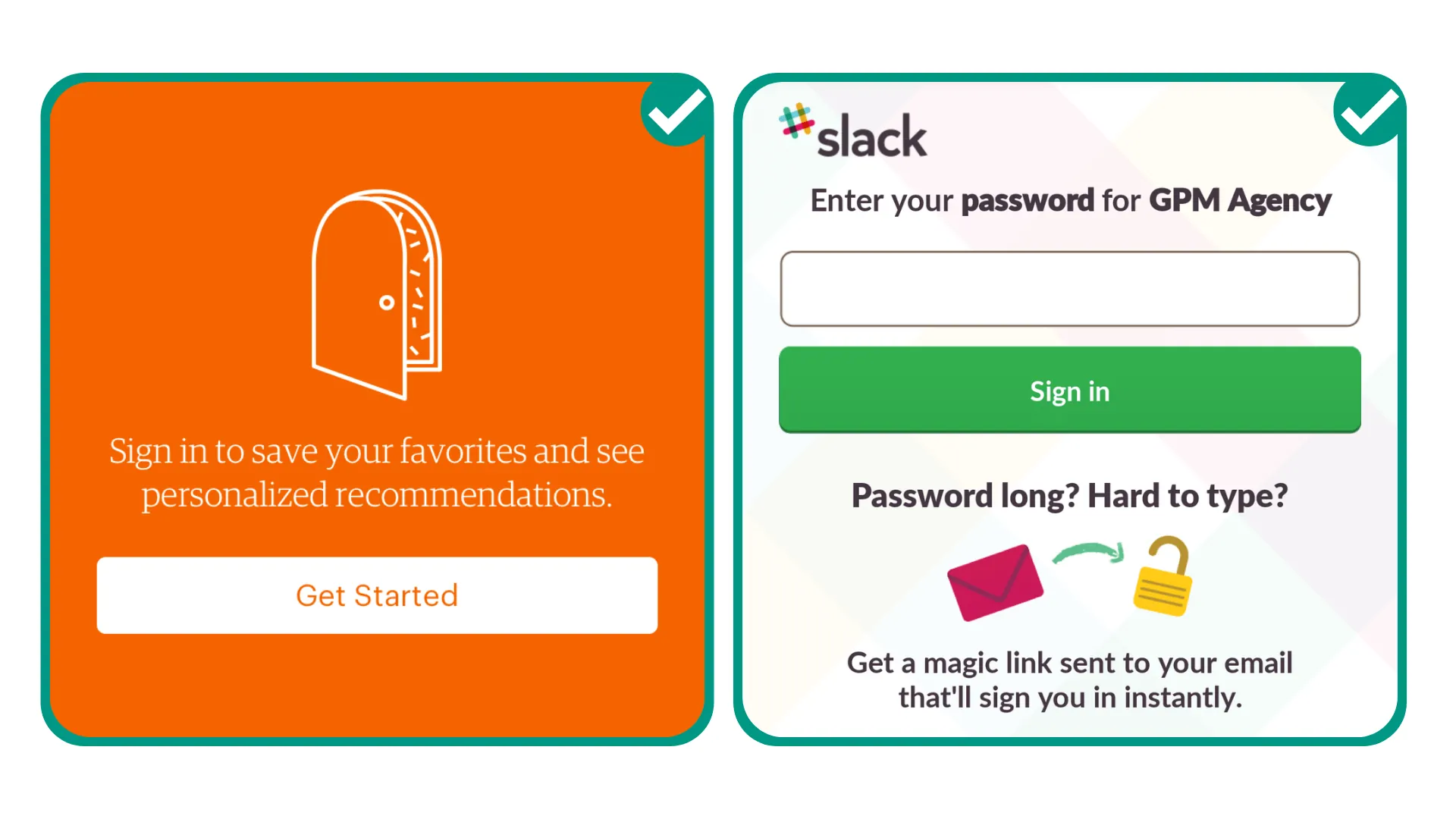
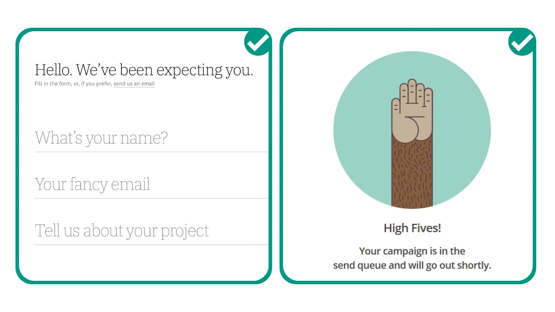
Экраны входа
Это ваше первое впечатление. У вас есть возможность рассказать людям, о чем вы, как вы можете им помочь и почему они вам нужны — без избыточности. Убедитесь, что вы просите пользователей предоставить только абсолютно необходимую информацию, чтобы эти экраны не выглядели устрашающе.
С визуальным конструктором Adalo — описанным как «простой как PowerPoint» — вы можете быстро переделывать дизайны экрана входа и тестировать различные подходы копирования без переделки с нуля.
Хорошие новости и подтверждения
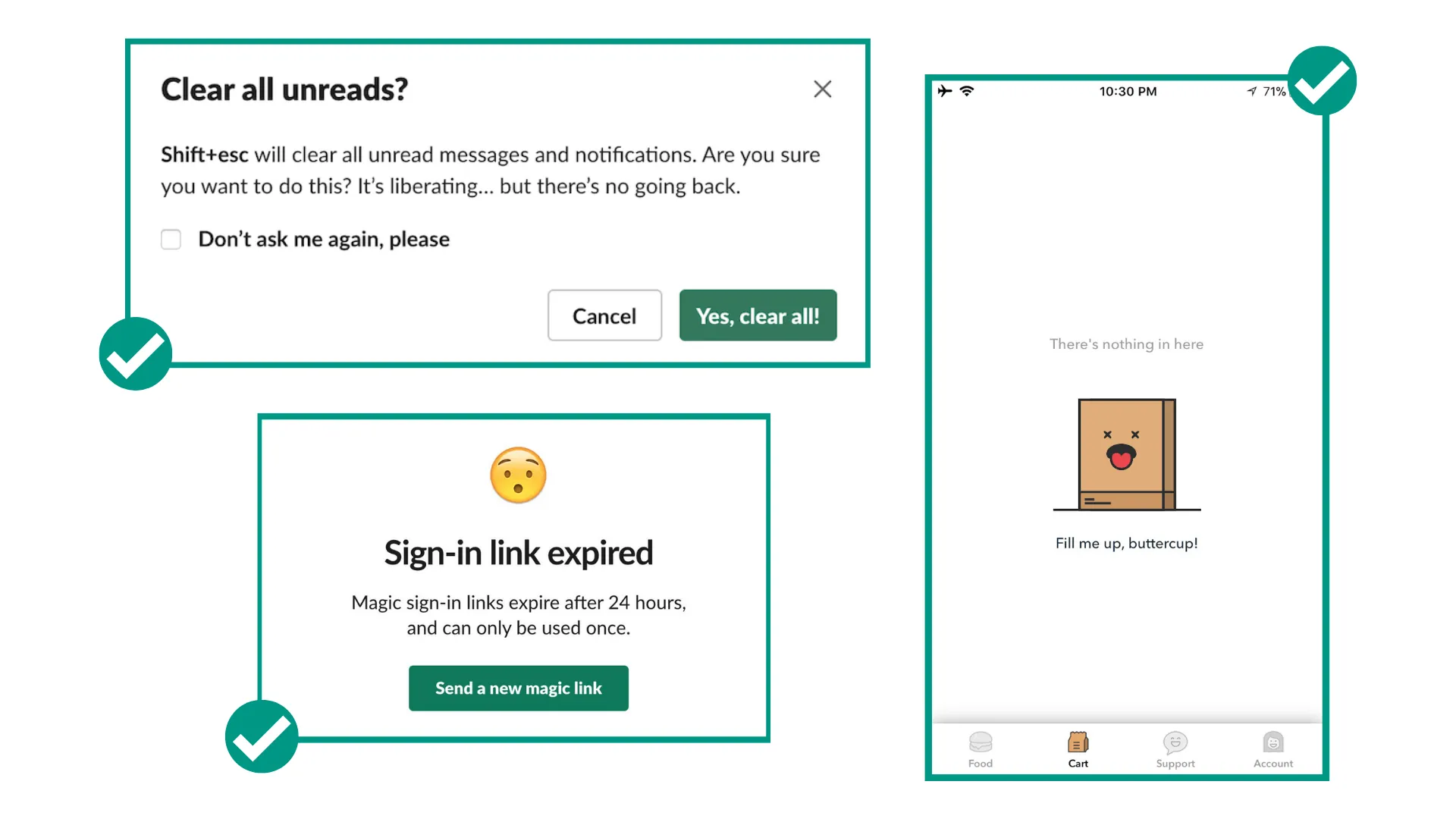
Эти экраны — это возможности отпраздновать с пользователями. Вы можете сделать текст веселым, неформальным и воодушевленным. Примеры: «Ура! Ты справился!» или «Результаты готовы: ты лучший игрок на этой неделе!» Это возможность продемонстрировать индивидуальность приложения.
Плохие новости и сообщения об ошибках
Это сложнее, поэтому лучше играть безопасно. Держите текст вежливым, но прямым. Примеры: «Ой, этот пароль не совпадает! Хочешь попробовать еще раз?» или «Ой! Мы не можем это найти!»
Пустые состояния
Если нечего показывать на экране, потому что пользователь еще не начал использовать конкретный инструмент или услугу, это хорошая возможность добавить полезный текст, изображение или даже юмор. Вместо просто «Результаты не найдены» вы можете попробовать «Ой, ваша сумка пуста!» или «Начнем!»
Подписи и вспомогательный текст
Это вспомогательный текст, обычно перед кнопкой или под значком, который обеспечивает уверенность или объясняет, что происходит дальше. Вы можете добавить сюда индивидуальность или использовать это как возможность быть особенно полезным.
Создание приложений, которые масштабируются благодаря отличному UX
Когда вы создаете приложение, которое может вырасти до тысяч или миллионов пользователей, ваша UX-копия становится еще более критичной. Каждый запутанный ярлык кнопки или неясное сообщение об ошибке умножается на всю базу пользователей.
Модульная инфраструктура Adalo масштабируется для обслуживания приложений с более 1 миллиона ежемесячных активных пользователей, без верхнего потолка. Платные планы включают неограниченные записи базы данных, что означает, что ваше приложение может расти без ограничений по хранилищу. Платформа обрабатывает более 20 миллионов запросов данных ежедневно с 99% + временем безотказной работы.
Эта масштабируемость важна для UX-копии, потому что вы можете сосредоточиться на совершенствовании ваших сообщений, а не беспокоиться о том, сможет ли ваше приложение справиться с успехом. С Волшебное добавлениевы можете добавлять новые функции, описав, что вам нужно на естественном языке — а затем сразу сосредоточиться на написании копии для этих новых экранов.
Начало работы с UX-копией вашего приложения
Вы можете использовать Шаблоны приложений Adalo чтобы создать приложение за несколько часов или создать его с нуля, настроенное в совершенстве. На платформе было создано более 3 миллионов приложений, что дает вам много примеров для обучения.
Если вам нужна дополнительная помощь, вы можете работать с экспертом Adalo который обладает навыками и знаниями, чтобы помочь вам со всем, от создания совершенно нового приложения до отладки и оптимизации существующего. Узнайте больше.
Удачи и приятного создания!
Часто задаваемые вопросы
Почему выбрать Adalo вместо других решений для создания приложений?
Adalo — это конструктор приложений на основе ИИ, создающий истинные нативные приложения iOS и Android из одной кодовой базы. В отличие от веб-обёрток, он компилируется в нативный код и публикуется прямо в Apple App Store и Google Play Store. С неограниченными записями базы данных в платных планах и без сборов на основе использования вы получаете прогнозируемые затраты по мере масштабирования вашего приложения.
Какой самый быстрый способ создать и опубликовать приложение в App Store?
Интерфейс Adalo с функцией drag-and-drop — описываемый как «простой, как PowerPoint» — в сочетании с Magic Start позволяет вам создавать полные основы приложений из простого описания. Платформа управляет процессом отправки в App Store, поэтому вы можете перейти от идеи к опубликованному приложению за дни, а не месяцы.
Смогу ли я легко написать эффективный UX-текст для своего приложения?
Да. Поскольку Adalo управляет всеми техническими аспектами создания вашего приложения, вы можете сосредоточиться на создании микротекстов, которые направляют, радуют и конвертируют ваших пользователей — от текста кнопок до сообщений об ошибках и всего остального. Визуальный конструктор позволяет легко редактировать текст без перестроения экранов.
Что такое UX-текст и почему он важен для моего приложения?
UX-текст — это весь текст, который направляет пользователей по вашему приложению: заставки, страницы регистрации, кнопки и варианты навигации. Хороший UX-текст рассказывает историю вашего продукта, помогает пользователям понять, что делать дальше, ясно объясняет ошибки и делает ваше приложение человечным и надежным.
Как сделать UX-текст своего приложения простым и эффективным?
Сосредоточьтесь на ответе на один вопрос на каждом этапе: «Что самое важное, что кто-то должен знать прямо сейчас?» Используйте короткие предложения (не более 8 слов, когда возможно), избегайте жаргона и читайте текст вслух, чтобы убедиться, что он звучит естественно, а не робко.
На какие экраны приложения следует обратить наибольшее внимание при работе с UX-текстом?
Обратите особое внимание на экраны входа (ваше первое впечатление), экраны подтверждения (возможности отметить это с пользователями), сообщения об ошибках (будьте вежливы, но прямолинейны) и пустые состояния (идеальны для полезного руководства или индивидуальности). Эти моменты — возможности быть уникальным, полезным и запоминающимся.
Следует ли использовать первое или второе лицо в тексте моего приложения?
Используйте первое лицо (я, мне, мой) чтобы показать пользователям, что принадлежит им, например «Мой профиль» или «Мой аккаунт». Используйте второе лицо (ты, твой) чтобы направлять пользователей через процессы или добавить личный штрих, например «Введите свой адрес электронной почты» или «Вы заработали значок!» Согласованность между этими подходами является ключевой.
Сколько стоит создание приложения с хорошим UX на Adalo?
Веб-конструктор и конструктор мобильных приложений Adalo начинаются с $36/месяц с неограниченным использованием и публикацией в app store. В отличие от конкурентов, которые взимают плату на основе записей базы данных или использования, платные планы Adalo включают неограниченные записи в базе данных и без платежей на основе использования, поэтому вы можете сосредоточиться на совершенствовании вашего UX без беспокойства о затратах масштабирования.
Нужен ли мне опыт программирования, чтобы написать хороший UX-текст?
Опыт программирования не требуется. Визуальный конструктор Adalo позволяет редактировать текст непосредственно на экранах, и вы можете мгновенно просмотреть изменения. Платформа управляет всеми техническими аспектами, поэтому вы можете полностью сосредоточиться на создании текста, который резонирует с вашими пользователями.
Быстро создавайте приложение с помощью одного из наших готовых шаблонов приложений
Начните создавать без кодаСвязанный контент
Как выбрать конструктор приложений на основе искусственного интеллекта в 2026 году: прототипы против рабочих приложений
Как выбрать конструктор приложений на основе искусственного интеллекта в 2026 году: прототипы против рабочих приложений
Сравните лучшие конструкторы приложений на основе искусственного интеллекта на 2026 год — Lovable, Bolt, v0, Cursor, Replit, Base44, Bubble, FlutterFlow и Adalo. Узнайте, какие инструменты быстро создают прототипы, а какие действительно отправляют в производство.

Как создать мобильное приложение без кодирования (руководство 2026) | Adalo
Узнайте, как планировать, проектировать и запускать приложения iOS и Android с помощью конструктора без кода Adalo. Это пошаговое руководство охватывает инструменты, шаблоны и другое.
Как использовать построители приложений без кода для паттерна Strangler Fig (в 2026 году) | Adalo
Узнайте, как применить паттерн Strangler Fig с помощью конструкторов приложений без кода для пошаговой модернизации устаревших систем в 2026 году.

Как создать приложение социальной сети: пошаговое руководство (2026)
Узнайте пошагово, как создать приложение социальной сети с помощью Adalo. Создавайте свое приложение с помощью этого руководства no-code, которое идеально подходит для начинающих.